Building a website has never been easier. Launching one that actually performs is a different story.
Modern platforms, templates, hosting tools, content systems, and no-code builders mean almost anyone can put a website online. That convenience is useful, but it also creates a trap. Because it is easier to build a site, many businesses assume that simply having a website is enough. It is not. A website that looks acceptable on the surface can still fail badly where it matters most: speed, usability, SEO, trust, lead generation, accessibility, and conversion.
That is why so many websites underperform even when they appear polished at first glance. Some load too slowly. Some look fine on desktop but break down on mobile. Some bury key information behind confusing navigation. Others never clearly tell visitors what to do next. Many publish content and then leave it untouched for months or years, gradually turning their site into a stale digital brochure instead of a useful business asset.
Most websites do not fail because of one dramatic flaw. They underperform because small, repeated points of friction quietly compound across speed, clarity, usability, trust, and conversion.
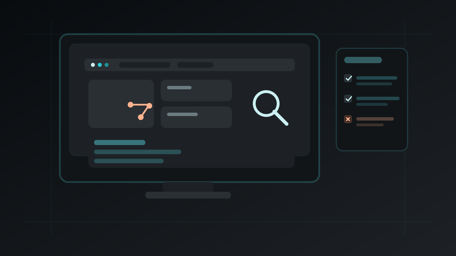
Why Website Mistakes Matter More Than Ever
A website is not just an online presence anymore. It is often the first sales conversation, the first trust test, the first product demonstration, and the first proof of credibility a customer sees. That means even basic weaknesses have commercial consequences.
A slow site creates doubt before a visitor reads a single word. A cluttered layout makes a business feel less credible. A broken mobile experience tells visitors the company is not paying attention. Weak navigation makes information harder to find, which increases abandonment. Missing SEO basics reduce discoverability, meaning strong products and services can remain invisible simply because the website is under-optimised.
Users are also less patient than they used to be. They compare your site not only with direct competitors, but with the best digital experiences they encounter anywhere. Fast platforms, intuitive interfaces, clean checkout flows, and helpful content have raised expectations across the board.
Mistake 1: Slow Loading Speeds
Speed is one of the most common and most damaging website problems. Visitors expect pages to load quickly. They do not want to wait for oversized images, bloated scripts, unoptimised themes, or overloaded hosting environments. Even a delay of a few seconds can increase bounce rate and reduce engagement. On commercial websites, slow loading pages can directly affect enquiries, signups, and sales.
Many websites become slow for predictable reasons. Images are uploaded at huge dimensions without compression. Third-party scripts are installed carelessly. Page builders produce bloated code. Fonts, animations, trackers, and embedded media pile up until the page becomes heavy and inefficient.

The fix starts with discipline. Compress images properly. Resize media to the dimensions actually needed on the page. Reduce unnecessary plugins and scripts. Use caching. Minify assets where appropriate. Review whether your hosting environment is genuinely suitable for the site’s traffic and functionality.
Mistake 2: Poor Mobile Experience
A website that fails on mobile is failing where much of the audience lives. Mobile browsing is not a side case anymore. For many businesses, it is the primary context in which users discover, compare, research, and engage. That means mobile design cannot be treated as a desktop layout that merely shrinks.
Poor mobile experience shows up in familiar ways. Text is too small. Buttons are too close together. Menus are awkward. Important elements sit below excessive visual clutter. Forms are frustrating to complete. Images overflow. Pop-ups become impossible to dismiss cleanly.
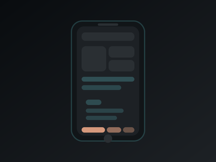
Good mobile experience is about clarity and priority. The layout should be clean. Text should be readable. Interactive elements should be easy to tap. Navigation should feel obvious. Forms should request only what is necessary.
Mistake 3: Ignoring SEO Basics
One of the most frustrating website mistakes is building something visually strong and then undermining it with weak search fundamentals. Pages launch without clear title tags. Meta descriptions are missing or duplicated. Headings are poorly structured. Images lack descriptive alt text. Internal linking is weak. URLs are messy.
SEO is not only about keywords. It is about clarity, structure, intent, and relevance. Every key page should have a clear purpose. Titles should accurately describe the page and support visibility. Headings should help both users and search engines understand the content hierarchy.

The strongest SEO websites are usually the ones that feel the clearest and most helpful to humans as well.
Mistake 4: Outdated or Generic Design
Design influences trust long before content has a chance to do its work. A website does not need to look fashionable for the sake of fashion, but it does need to feel current, intentional, and aligned with the business behind it. Outdated design makes a company look neglected. Generic design makes it forgettable.
A generic template is not automatically bad. Many sites begin with templates. The problem is leaving the design at its most generic level with minimal brand distinction, weak messaging hierarchy, inconsistent image treatment, and no visual personality.

Mistake 5: Weak Security
Security is one of those areas people underestimate until something goes wrong. Many businesses still treat security as a technical afterthought rather than a core part of website quality. That is risky. A compromised site can damage customer trust, disrupt operations, harm search visibility, and create reputational problems that linger well beyond the incident itself.
Good website security begins with fundamentals. Use secure certificates. Keep the core platform, plugins, and dependencies updated. Limit unnecessary integrations. Enforce strong authentication practices. Take backups regularly and ensure they can actually be restored. Review user permissions. Monitor the site for suspicious behaviour.

Mistake 6: Lack of Clear Calls to Action
A website can attract traffic, look polished, and still fail because it never clearly asks the visitor to do anything. This is one of the most common conversion mistakes. Businesses spend time on branding, messaging, and layout, but the calls to action remain vague, hidden, inconsistent, or too passive.
Users should not have to guess whether the next step is to book, buy, enquire, register, subscribe, compare, contact, or learn more. The journey should feel guided. Strong calls to action reduce hesitation and keep momentum moving.

Mistake 7: Overloading the Site With Pop-Ups and Distractions
Too many pop-ups, banners, prompts, autoplay elements, chat interruptions, overlays, and ads can turn a site into a frustrating obstacle course. Even when each element has a business purpose, the combined effect can feel aggressive and low trust. This is especially damaging on mobile, where screen space is limited and interruptions feel even more intrusive.
Use interruptions sparingly and only when they offer genuine value. Delay them long enough for the visitor to engage with the page first. Ensure dismissal is easy and obvious. Keep the experience clean. Every layer of distraction should justify its presence.

Mistake 8: Not Updating Content
A stale website quietly weakens itself over time. Outdated content sends the wrong message to both users and search engines. It can make a business appear inactive, careless, or disconnected from its own offer. Even if the core service is strong, neglected content creates doubt.
Content maintenance is not only about publishing more. It is about keeping important pages accurate, useful, and current. Sometimes refreshing an old page produces more value than writing a new one.

Mistake 9: Weak Navigation and Site Structure
When people cannot find what they need quickly, they leave. Navigation is one of the clearest signals of whether a website understands its users. Strong navigation makes a site feel intuitive. Weak navigation makes even good content feel inaccessible.
A strong site structure begins with simple questions. What are users most likely to want first? What information matters most commercially? What tasks should feel easiest? Which pages deserve primary visibility, and which belong one level deeper?

Mistake 10: Forgetting Accessibility
Accessibility is too often treated as optional. It is not. A website should be usable by as many people as possible, including people with visual, auditory, motor, and cognitive differences. Ignoring accessibility excludes part of the audience and creates a weaker experience overall.
Many accessibility improvements are also general usability improvements. Better contrast improves readability for everyone. Clearer button labels help all users. Proper heading structure makes content easier to scan. Keyboard-friendly interaction improves usability beyond assistive technology contexts.

How These Mistakes Affect Business Results
It is easy to think of website mistakes as technical details, but they almost always become business problems. Slow speed reduces engagement and conversion. Poor mobile experience loses traffic where users are most active. Weak SEO lowers visibility and discovery. Outdated design reduces trust. Security issues create risk. Missing calls to action reduce lead flow. Distractions increase abandonment. Stale content weakens credibility.
When several of these problems exist at once, the damage multiplies. A website does not need to be perfect to perform well, but it does need to avoid obvious friction. The strongest sites usually win because they make the basics feel effortless.

How to Audit a Website More Effectively
A useful way to think about improvement is to audit the website from the outside in. Start with first impressions. Does the site look current, credible, and aligned with the business? Then move to performance. Does it load quickly on both desktop and mobile? Review the content. Is the messaging clear? Are key pages useful and current?
- Review the homepage, service pages, contact flow, and menus on both desktop and mobile.
- Check the site’s technical trust factors: security, broken links, metadata, indexing basics, and accessibility signals.
- Follow the journey as a new visitor, an evaluating buyer, and a returning user to find where friction is actually appearing.
The aim is not to chase endless perfection. It is to remove the friction that most directly blocks trust, visibility, and action.
Want a website that performs better in search, feels stronger on mobile, and converts more visitors?
Start by fixing the fundamentals that most websites still get wrong: speed, clarity, navigation, security, and accessibility.
Talk to ANOMONIXConclusion: Build Smarter, Not Just Better Looking
A website in 2026 cannot succeed on appearance alone. Design matters, but performance matters more than decoration. Clarity matters more than cleverness. Trust matters more than visual noise. A strong website is not the one with the most effects, the most animations, or the loudest sales prompts. It is the one that helps visitors move smoothly from interest to confidence to action.
Avoiding these 10 common website mistakes will put your site on much stronger ground. Improve speed. Prioritise mobile experience. Get the SEO basics right. Keep design current and purposeful. Take security seriously. Use clear calls to action. Reduce distractions. Maintain content. Simplify navigation. Build for accessibility.
Frequently Asked Questions About Common Website Mistakes
What are the most common website mistakes?
The most common website mistakes include slow loading speeds, poor mobile usability, weak SEO basics, outdated design, weak security, unclear calls to action, too many pop-ups, stale content, poor navigation, and lack of accessibility.
Why do website mistakes matter so much?
Website mistakes matter because they affect user experience, search visibility, trust, engagement, and conversions. Even small usability or performance issues can reduce traffic quality and lead generation.
How can I tell if my website is too slow?
A website may be too slow if pages take several seconds to load, images feel heavy, interactions lag, or mobile performance is weak. High bounce rates and low engagement can also signal speed problems.
Does mobile design affect SEO?
Yes. Mobile experience affects usability and search performance because mobile-first design and page quality influence how well a site serves users across devices.
How can I improve an underperforming website?
You can improve an underperforming website by auditing speed, mobile usability, SEO structure, content quality, navigation, security, accessibility, and conversion paths, then fixing the biggest friction points first.